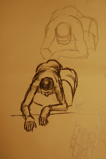
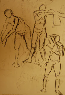
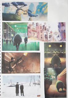
To find the right style for the character designs and animation I looked at a few different artists and artwork. I found a really nice black and white printed image in a book about the Titanic, however I wasn't quite sure if this would look a little boring and I kind of wanted to do something in more detail and that I could work on a bit more. I looked at various artists, I really love the sketchy style of Degas, and thinking about used pastels and softer colours I found some art work from 1912 in this kind of style. In particular I really like the piece below by Ken Kirsch. It has a very soft, appealing look to it, all smooth edges, no harsh black outlines, and I think this could work really nicely for a piece of concept art.
In light of this I then remembered an artist that I had in a calender - Nadeem, whose work is all very soft, no harsh outlines, very pastel based and works really well considering lighting and shading. This then fits with the first image I found of the black and white print where light and shadows is obviously a very important part of the image.

With this in mind I also found some more photos from a book called, 'Titanic Voices' of outfits, costumes designs and objects actually recovered from the Titanic. I then began to finalise the general look and design of the main Doctor character.

I decided to make the character very different to the usual style and image of the Doctor known in the series. I wanted him to be a bit of a suave, stylish character with attitude and a bit of charm. I decided to make him a black character taking inspiration from Frozone from the Incredibles, Cobra Bubbles, and I guess Will Smith- type characters, a bit men in Black style.
I have various reasons for creating the character in this way. The main one, was simply looking for a very unique different character, that plays it cool, and isn't the usual Dr Who. Also, recently when choosing the new actor to play Dr Who they were considering putting in the first black actor to play the Dr. I also had the time of the script greatly in mind when designing the Doctor character. It is obviously based around 1912ish times when the Titanic incident occurred, and at this time although slavery had been abolished, black people where still thought of somewhat as second class citizens. I thought it could be really interesting - as the Doctor is a time lord and therefore in this case is actually from nowadays travelling back in time - to have him going back and perhaps the reaction of the characters towards him may be slightly different. In this particular script as well, the Doctor befriends a group of people generally thought of one this ship as lower class - e.g. the couple who won tickets, a waitress that works there, a historian that has got all his information completely wrong etc. Also in the script the Doctor is asked why he is in charge, and he comes back with a speech about saving Earth and humanity, which I think would work brilliantly for a black Dr in the past in this situation.


Using the design for the Doctor as far as it has got, I then tried to create it using a few different methods to try and get this soft pastel look that I liked from my inspirational artwork and work I found from 1912. I think some of the attempts below worked better then others. I tried watercolour, chalks, pencil...

I then tried out my other character design for the assistant, Astrid, in the same chalk pastel style. I think this one worked a little better then the Doctor design, however I found it was very hard to see how they would look and work without a background. Also I think because they are on white paper and don't have a solid black outline, it is hard to pick out the full shape and design of the character.
To solve this I think I need to look into the style a little more. I may go back to the first image I found and perhaps find more posters for the time that have been made in a similar style. Before finalising the designs and creating proper turn arounds I would really like to find the right style and experiment a little more to get it looking better before going any further. What I might try is combining few styles that I've found from the time. As I really like the Nadeem and Kirsch soft pastel backgrounds, maybe I could continue using the idea of light and dark and shadows, but make the characters black and white. But would this work together when is comes to compositing the whole thing? or would it look like two separate animations and levels?
more experimentation needed....


.jpg)


