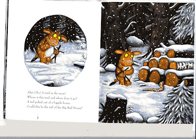
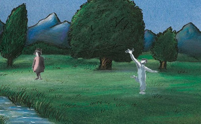
So, to overcome this I have been looking at illustrators and images from books. One that really caught my eye was illustrations from the gruffalo books by Axel Scheffler. I really like this style as it is bold and clear but still has that sketchy quality that makes it a little different and more appealing to look at. I found more of his work online and think that this kind of style could work really well for my piece. I think it would make the background and landscapes stand out which is the main focus of the story. Having got my characters looking close to the way I want them I need to make sure that the two compliment each other and that the backgrounds don't drown out the characters or look ridiculous. So, below are a few images..one of the design from the book and the background I really like, one where I have added in a couple of my basic characters designs just to see how it looks, and another where I have basically tried to digitally emulate Schefflers illustration...

Below i have added in my characters. Obviously the background was designed for another composition so my characters don't fit into it well, however I still think they have potential to work together and don't look too odd, or like two completely different designs.

Below I have emulated the image. I think it works OK, however due to my limited knowledge and previous use of photo shop I think it might be more successful to hand draw the images, or at least the outline and black sketchy lines and maybe colour on the computer.

No comments:
Post a Comment